
Project direction
A dashboard language designed around decisions first and data density second.
A dashboard language designed around decisions first and data density second.
Too many signals were visible, but the important decisions were still buried.
Organise information by decision priority rather than by data source.
A clearer analytics language that makes dense product states easier to scan and act on.
The concept imagines an operational analytics product that needs to surface a large amount of information without turning every screen into a dense dashboard. The proposed system uses stronger hierarchy, progressive detail and a visual language that supports scanning before investigation.
The concept focuses on a system where product positioning, interface hierarchy, data states and interaction logic reinforce the same decision-making objective.
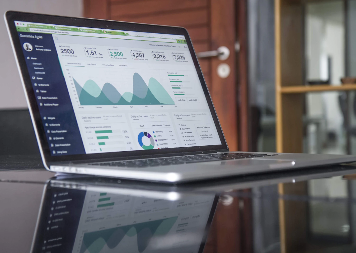


Separated monitoring, diagnosis and action so each screen has one dominant job.
Established repeatable patterns for status, trend, exception and comparison states.
Protected decision-critical information on smaller screens instead of simply shrinking desktop views.
The proposed visualization and state patterns are designed to make dense operational information easier to scan across roles and screen sizes.
The product can add new metrics and workflows without every release introducing a new visual convention.