Fewer support contacts24% — Illustrative seeded metric for the demo case study.
Performance target90+ — The production system is designed around a 90+ Lighthouse target on key templates.
The challenge
What needed to change.
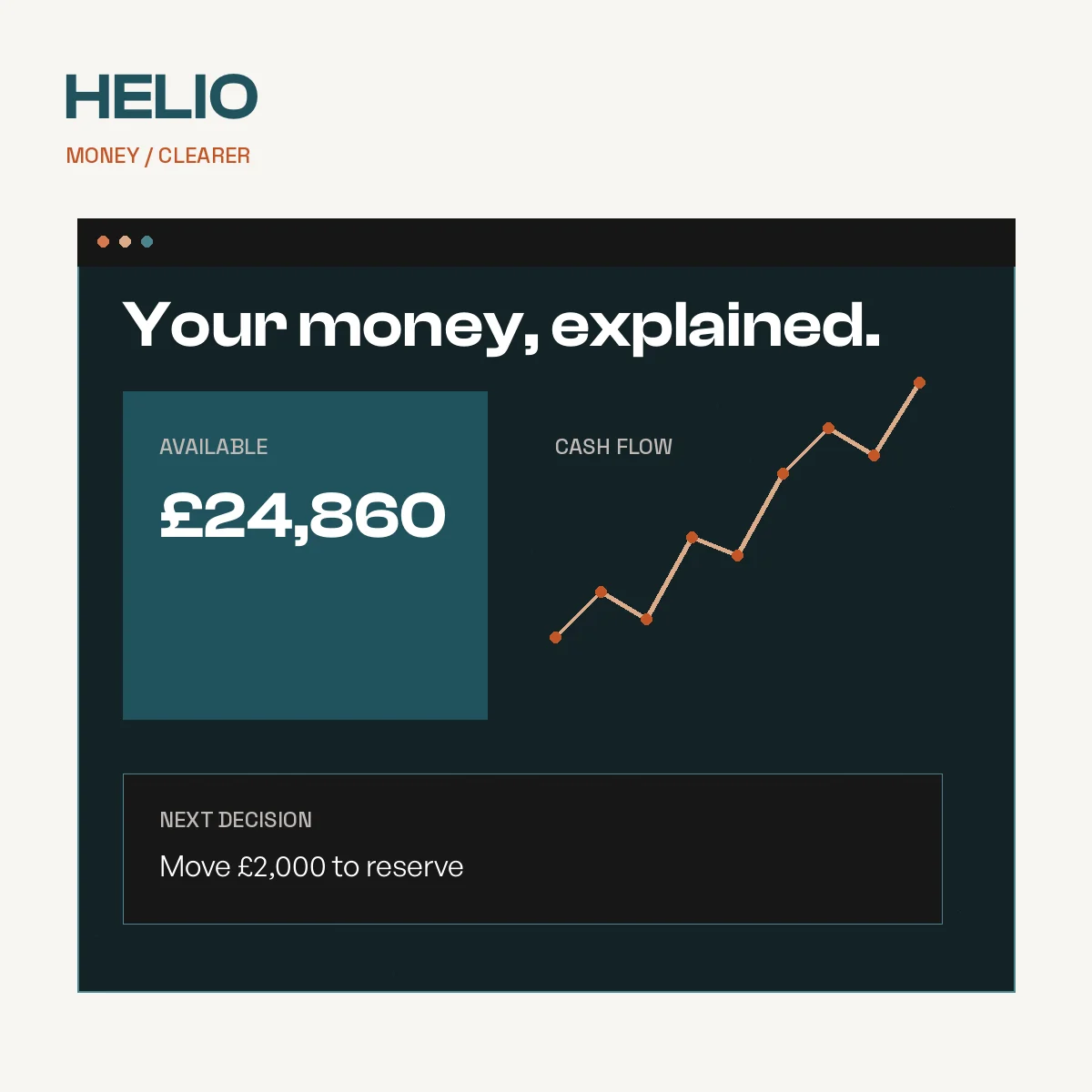
Helio’s users had access to powerful information, but the interface surfaced too much data without enough hierarchy around the decisions that mattered.
The strategic shift
Prioritize explanation and action over dashboard volume, turning product complexity into a set of clear decision patterns.
Strategy
UX
Interface system
Front-end
The approach
Moves that made the difference.
Each move links strategic intent to something people can see, use or measure.
01
Prioritize user decisions
Mapped the financial moments that carry the most uncertainty and redesigned around those tasks.
02
Create explanation patterns
Built reusable content and visualization patterns for fees, risk and next actions.
03
Build for change
Implemented a component system that can absorb new products without returning to page-level redesign.
Outcomes
What the work made possible.
Launch outcomes shown here should be replaced with approved, verifiable client results before public publication.
01
24% Fewer support contacts
Illustrative seeded metric for the demo case study.
02
90+ Performance target
The production system is designed around a 90+ Lighthouse target on key templates.
 View profile
 View profile
 View profile